The main aim of this task if to introduce ourselves into software such as: Adobe InDesign and Adobe Photoshop.
The project is to create a simple front page to a SDC magazine. We will also be required to write a brief blog on decisions, planning and evaluating during and after our work.
To start with we had to make flat plans of our work, this was so we could grasp a clear view of what we wanted our front page and contents to look like, in terms of the images and the layout. Full on text was not added onto this, as it wasn't compulsory at the time. But in my head i had a rough idea as to what i wanted to write.
We had to create an appropriate image to accompany the main flash, and draw in attention to the magazine. This could either be taken at college or at home using what ever facilities you had access to.

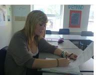
This photo taken above i considered using as my actual photo to my magazine, but i decided that it wasn't relevant enough to what i wanted to base my main flash on. Which meant i took another that i felt was more appropriate, this photo being below. It fell more into the right image as it was taken in a subject classroom; relevant to my main flash.

The way in which you photographed the person involved, was key to sending across the right message. In this case it was only asked for us to take a medium close up, so in other words the head and the upper body was in view.
Using the scanner at college i was able to show my work on the blog, as you can see both my contents and front cover above.
I then was ready to open up InDesign and start to work properly on completing the task.
I had my flat plan to copy so it didn't waste time changing or creating ideas. When i had put everything on that i previously mapped out, i felt there was too much space so i added in another story 'SDC update on sporting events.' this made the page seem more filled up.
Making my contents page was easier as all that was needed was the basic layout, and the way of which you wanted to present your columns.
On my contents, i copied the same font heading as i had on the front cover and just made it so it suited my new heading e.g font size, tracking, kerning, and both the horizontal and vertical scale. I left space for a total of 10 pages, which as a layout clearly leaves space for more, but at the same time makes it look enough as its neat and easy to read and understand.
In conclusion, i was happy with the cover and contents to my magazine. I did keep them fairly, if i had to do this again i may work harder on producing a more complex and interesting colour scheme. But i was pleased with the way it has turned out.


